Mobile navigation can make or break your app’s user experience. For Progressive Web Apps (PWAs), choosing the right navigation design is critical. Why? Because 70% of users abandon apps with poor navigation, and 30-40% of usability issues stem from navigation problems. This guide covers 10 key navigation patterns for PWAs, each tailored to different use cases and user behaviors.
Here’s a quick summary of the patterns:
- Bottom Navigation Bar: Ideal for 3-5 primary actions; thumb-friendly and boosts engagement.
- Hamburger Menu: Saves screen space but can reduce discoverability; works for secondary options.
- Tab Bar Navigation: Keeps core features visible; great for apps with 3-5 main sections.
- Gesture-Based Navigation: Intuitive for swiping and immersive content but requires user familiarity.
- Floating Action Button (FAB): Highlights a single key action; compact and thumb-accessible.
- Side Drawer Navigation: Hides secondary actions; useful for complex hierarchies.
- Top Navigation Bar: Best for desktop-to-mobile transitions but less one-hand friendly.
- Modal Navigation Overlays: Focuses on specific tasks like forms or filters; grabs user attention.
- Card-Based Stacked Navigation: Perfect for multi-level content or task flows.
- Search-Centric Navigation: Prioritizes search for apps with extensive content libraries.
Why It Matters:
- 60% of users browse one-handed, so thumb-friendly designs like bottom bars and FABs are more accessible.
- Hidden menus (e.g., Hamburger) risk being overlooked, while persistent options (e.g., Tab Bars) improve engagement.
- Airbnb’s switch to a bottom navigation bar increased task completion by 40%.
- Pinterest’s move from a Hamburger Menu to a Tab Bar boosted engagement by 60%.
The takeaway? Match your navigation design to user needs and app goals. Whether it’s a simple bottom bar or a gesture-based system, the right choice can improve usability, retention, and task completion rates.
Mobile Design Patterns You Must Use
sbb-itb-e3aed85
1. Bottom Navigation Bar
The bottom navigation bar places 3–5 key destinations within easy reach of your thumb. This design choice aligns with user behavior, as 75% of users interact with their phones using only one thumb, and 49% hold their devices with a one-handed grip.
Thumb Accessibility
As phone screens grow larger, the top of the display has become harder to reach. Bottom navigation solves this by applying Fitts's Law, which states that the time required to interact with a target depends on its size and distance. By positioning menu items close to the thumb, interaction becomes quicker and easier.
"A bottom hamburger menu icon will have a much lower interaction cost compared to the top menu icon because it's closer." - Arturas Leonovas, UX/UI Designer
To ensure smooth usability, navigation items should meet minimum touch target standards - 44x44 pixels for iOS and 48x48 pixels for Android. This minimizes accidental taps and accommodates less precise movements.
Screen Space Usage
Bottom navigation bars typically range between 49 and 56 pixels in height. Many progressive web apps (PWAs) hide the bar when users scroll down, maximizing screen space, and reveal it again when scrolling up. For web-based PWAs, CSS environment variables like padding-bottom: env(safe-area-inset-bottom); ensure the navigation bar doesn’t interfere with iOS home indicators or system gestures. This approach keeps the layout efficient and user-friendly.
Best PWA Use Case
This design works best for PWAs with 3–5 equally important top-level destinations. For example, Airbnb switched to a bottom tab bar with five sections and found that users completed tasks 40% faster compared to their old hamburger menu. Similarly, Spotify uses a three-item bottom bar (Home, Search, Your Library) to keep users focused on core functions. For more complex SaaS PWAs, combining a bottom bar for primary tasks with a hamburger menu for secondary options - known as "combo navigation" - has proven effective, increasing interactions by 150% compared to hidden menus.
Engagement Impact
Switching to bottom navigation can significantly boost user engagement. Redbooth (formerly Teambox) replaced their hamburger menu with a bottom tab bar and saw a 65% increase in daily active users and a 70% rise in average session time. Adding text labels to icons further enhances engagement, with studies showing up to a 75% improvement in interaction rates compared to icon-only designs. By keeping primary destinations visible and within reach, bottom navigation helps users stay engaged and complete tasks more efficiently.
2. Hamburger Menu
Bottom navigation focuses on thumb-friendly design, but the hamburger menu takes a different approach by prioritizing content space.
This menu style hides navigation options behind a three-line icon, usually placed in a corner of the screen. It’s a great way to save space, especially for content-heavy PWAs with complex navigation. However, the trade-off is reduced accessibility and engagement since users have to actively open the menu to access features.
Screen Space Usage
By collapsing navigation into a single icon, the hamburger menu frees up valuable screen space for content. This makes it a good fit for PWAs where users spend more time browsing and consuming information rather than frequently switching sections. It can handle six or more navigation options, including subcategories and secondary features like settings or help pages, without overwhelming the interface.
That said, hiding navigation can create discoverability challenges. Users might miss features that aren’t immediately visible. As Nick Babich, Developer and UX Enthusiast, puts it:
"What's out of sight is out of mind. When navigation is hidden, users are less likely to use it."
- Nick Babich, Developer and UX Lover
Thumb Accessibility
Traditional hamburger menus are typically located in the top-left or top-right corner, which can be tough to reach for the 49% of users who navigate with one hand. To address this, modern designs often include swipe gestures from the screen edge, making it easier to open the menu without stretching for the icon. Once the menu is open, placing frequently used items in the middle or lower sections of the drawer can improve accessibility. It’s also essential to follow platform guidelines for minimum touch target sizes to ensure usability.
Best PWA Use Case
Hamburger menus shine in PWAs with six or more navigation options or in cases where content takes priority over frequent navigation. They work particularly well in hybrid designs - combining a bottom tab bar for the top three to five actions with a hamburger menu for secondary features. However, for task-oriented PWAs where users need to move quickly between core sections, the extra step of opening the menu can slow them down and increase interaction costs.
Engagement Impact
Hidden navigation can negatively affect user engagement since it requires effort to discover features. Research shows that 70% of users abandon apps with overly complicated navigation, and navigation issues account for 30–40% of mobile usability problems. To counter this, pairing the icon with a "Menu" label can make it more intuitive. Additionally, keeping the menu structure flat instead of using nested dropdowns - and providing clear feedback when items are tapped - can improve usability. This highlights the importance of clear, user-friendly navigation, which remains a key consideration as we explore other design patterns.
3. Tab Bar Navigation
Tab bar navigation offers a straightforward way to keep essential functions within reach, unlike the hidden hamburger menu. By dedicating a small portion of screen space at the bottom, tab bars display three to five primary sections, ensuring key options remain visible and easy to access.
Thumb Accessibility
Tab bars are designed with ergonomics in mind, sitting comfortably in the "thumb zone" - the area where most mobile users naturally interact with their devices using one hand. Studies show that approximately 60% of users operate their phones this way. This placement reduces the need for awkward hand movements, especially compared to menus located in the top corners. To ensure usability, each tab should meet the minimum touch target sizes defined by mobile design standards .
A real-world example comes from Airbnb: in February 2026, the company reported a 40% faster task completion rate after switching to a bottom tab bar with five primary sections, replacing their previous hamburger menu setup. For Progressive Web Apps (PWAs), it’s important to consider device-specific factors like notches or home indicators when implementing tab bars .
Screen Space Usage
Tab bars do take up a small portion of the screen - usually between 50 and 80 pixels of vertical space. However, their persistent visibility as users scroll significantly reduces cognitive load by eliminating the need to recall hidden features. To maximize clarity, pairing icons with short text labels is essential. Relying on icons alone can lower user comprehension by as much as 30% to 40%.
Best PWA Use Case
Tab bars work best in PWAs that focus on three to five main sections. They’re ideal for applications like social feeds, e-commerce platforms, or search tools. If additional sections are necessary, a hybrid approach can combine the tab bar for primary actions with a hamburger menu for secondary options.
Engagement Impact
Persistent navigation like a tab bar encourages users to explore core features more readily. Unlike hidden menus, which often fall victim to the "out of sight, out of mind" problem, tab bars make switching between sections quick and intuitive. This visibility is crucial, as 70% of users abandon apps with overly complex navigation. Moreover, users who can’t find what they need within 10 to 15 seconds are likely to leave altogether .
To further enhance usability, clear active states - such as bold icons or distinct color changes - help users identify their current location instantly. This reduces confusion and creates a smoother, more enjoyable experience.
4. Gesture-Based Navigation
Gesture-based navigation offers a smooth and intuitive way for users to interact with Progressive Web Apps (PWAs). By enabling actions like swiping, pinching, or long-pressing, it removes the need to hunt for small buttons tucked into awkward corners. This approach works alongside traditional navigation methods, simplifying how users interact with apps.
"Mobile-first isn't a buzzword. It's designing for how people actually use your app - standing, walking, distracted, one-handed." - Paul Badarau, Elaris Software
Thumb Accessibility
Gestures solve a common ergonomic issue by replacing hard-to-reach buttons with easy, screen-wide motions. This design makes navigation faster and more natural. For example, swiping takes about 100ms, compared to the 500ms it can take to locate and tap a button. Apps like Instagram and TikTok have made swipe-based interactions second nature, making users more comfortable with this navigation style.
Screen Space Usage
By removing the need for visible menus, gesture navigation opens up more screen space, creating an immersive, content-focused experience. However, since gestures aren’t always obvious, it’s important to guide users with subtle animations or prompts like “Swipe to explore” during their first interactions. To maintain accessibility, include visible fallback buttons for essential actions.
Best PWA Use Case
Gesture navigation shines in areas like image galleries, open-source drawing tools, storytelling apps, open-source CMS platforms, or media-heavy platforms where immersion matters. Horizontal swipes are perfect for browsing product carousels or photo collections, while vertical swipes work well for dismissing modals or triggering pull-to-refresh actions. Long presses can also reveal context menus without cluttering the interface. However, be cautious to avoid conflicts with system-level gestures. For instance, users expect edge-swipes to navigate back, and overriding this can lead to frustration.
Engagement Impact
When done right, gesture navigation feels invisible, letting users focus on the content rather than the mechanics of navigating. This is crucial since navigation-related issues account for 30% to 40% of mobile usability problems. To ensure a smooth experience, provide immediate visual feedback through animations or transitions. Without this, users may repeat gestures or abandon the action entirely, undermining the benefits of faster and more intuitive navigation.
5. Floating Action Button (FAB)
The Floating Action Button (FAB) is a circular button that floats over your content, usually in the bottom-right corner of the screen. Its purpose? To highlight a key action - like composing an email, creating an event, or starting a chat. Unlike navigation bars that stretch across the entire screen, FABs are compact and always visible, making them a sleek addition to a user interface. Let's dive into how its design prioritizes thumb accessibility and minimizes interference with screen content.
Thumb Accessibility
The FAB is strategically placed in the "thumb zone", which is the bottom-right area of the screen that's easiest to reach with one hand. This is especially useful since about 60% of users browse with just one hand. When multiple FABs are used, arranging them with flex-direction: column-reverse ensures the most important action stays closest to the thumb. To account for less precise taps, FABs also adhere to standard touch target sizes.
"The design of the floating action button hinges on the premise that users will perform a certain action most of the time." - Nick Babich
Screen Space Usage
FABs are space-efficient compared to tab bars since they don’t occupy an entire row. However, because they float over content, they can sometimes obscure important elements like timestamps or favorite icons, which may require users to scroll more. To address this, developers can use an aria-label for screen readers and set aria-hidden="true" on the internal icon to improve accessibility. On iOS Progressive Web Apps (PWAs), CSS environment variables like padding-bottom: env(safe-area-inset-bottom) help prevent the FAB from overlapping the system home indicator.
Best PWA Use Case
FABs work best for positive, action-oriented tasks such as "Create", "Share", "Play", or "Add to Cart." They should never be used for destructive actions like "Delete". For example, email apps use FABs to compose messages, calendar apps for scheduling events, and e-commerce PWAs for adding products to a cart. To maintain a clean visual hierarchy, only one FAB should appear per screen. If the icon isn’t immediately clear, pairing it with a text label can boost user understanding by up to 30–40%. By focusing on a single, high-priority action, FABs complement other navigation patterns effectively.
Engagement Impact
Beyond its functional benefits, the FAB also enhances user engagement by providing clear and immediate feedback. It acts as a helpful guide, especially for new users exploring unfamiliar screens. While it might slightly slow initial interactions, studies show that once users understand its purpose, they operate it more efficiently than traditional buttons. Adding visual feedback - like changes in box-shadow or background-color - helps confirm taps, reducing repeated attempts or abandoned actions. This makes the FAB not just a design feature but a tool for improving the overall user experience.
6. Side Drawer Navigation
The side drawer is a navigation tool that slides in from the screen edge, offering a space-efficient way to house links. Apps like Gmail and Slack rely on this design to manage complex navigation hierarchies. This approach balances content visibility with functional navigation, making it worth examining its ergonomic effects.
Thumb Accessibility
One common issue with side drawers is the placement of the hamburger icon, often tucked into hard-to-reach corners. This can create accessibility challenges, particularly for users relying on one-handed operation. To address this, consider enabling edge-swipe gestures to open the drawer. Inside the drawer, ensure navigation elements have touch-friendly dimensions - at least 44x44 pixels on iOS or 48x48 pixels on Android - to accommodate less precise thumb taps.
Screen Space Usage
A major strength of side drawers is their ability to stay off-screen until needed, freeing up nearly 100% of the viewport for primary content. This is particularly effective for apps with immersive experiences, such as news readers, social feeds, or video platforms, where uninterrupted content viewing is a priority. For PWAs with complex navigation, this design ensures users can focus on content without distractions.
Best PWA Use Case
Side drawers work best for secondary actions like Settings, Support, Account Management, or Legal Information. They’re especially useful for content-heavy PWAs with deep category structures, such as e-commerce sites or productivity tools. To keep navigation intuitive, limit the drawer to less critical functions, leaving your top three to five priorities accessible through a bottom tab bar. Inside the drawer, pair every icon with a clear text label - relying solely on icons can reduce user understanding by 30–40%.
Engagement Impact
Complex or confusing navigation is a dealbreaker for many users - about 70% will abandon an app if it’s hard to navigate. To prevent this, offer multiple ways to close the drawer, such as an "X" button, tapping the overlay, or swiping the drawer away. Smooth transitions using CSS (e.g., translateX) add to the user experience, making the drawer feel more polished. Finally, enhance accessibility by including proper ARIA roles like aria-expanded and aria-controls, ensuring compatibility with screen readers.
7. Top Navigation Bar
The top navigation bar is a design pattern borrowed from desktop interfaces, placing the main navigation options at the top of the screen. It’s particularly effective for PWAs with 3 to 5 primary categories, where quick access and visibility take precedence over thumb accessibility. For instance, Google Calendar features a top bar with a hamburger menu, a search function, and a "Today" button, while the BBC website uses it to showcase its main news categories clearly.
Thumb Accessibility
Since the top navigation bar is positioned outside the natural thumb zone, it can be challenging to use with one hand - especially since around 60% of mobile users browse this way. To make navigation easier, consider adding a sticky header that reappears when users scroll up. This keeps navigation within reach without requiring constant repositioning. Additionally, ensure touch targets meet size standards: at least 44×44 pixels for iOS and 48×48 pixels for Android. This reduces the likelihood of accidental taps.
Screen Space Usage
Top navigation bars occupy valuable above-the-fold space, so using this area wisely is critical. A common approach is auto-hiding the bar during downward scrolling to maximize content visibility, as seen in content-heavy PWAs like Medium. The bar then reappears when the user scrolls back up. To avoid clutter, limit the bar to essential elements only, ensuring it doesn’t overwhelm the limited screen space.
Best PWA Use Case
Top navigation is ideal for PWAs transitioning from desktop websites, as it helps maintain brand consistency. It works particularly well for content-focused platforms like news sites or blogs, where users primarily browse and consume information. For example, Spotify’s mobile PWA uses a top app bar for secondary actions like "Settings", "Recently Played", and "Latest Releases", while reserving primary navigation for the bottom bar. To enhance usability, always pair icons with text labels - studies show that icons alone can reduce comprehension by 30–40%. This approach not only improves clarity but also strengthens user engagement and brand recognition.
Engagement Impact
Navigation plays a critical role in user retention - about 70% of users will abandon an app if they find its navigation confusing. A visible top navigation bar can boost discoverability compared to hidden menus, helping to avoid the "out of sight, out of mind" problem associated with hamburger menus. Since users tend to leave mobile sites if they can’t find what they’re looking for within 10–15 seconds, it’s best to limit the top bar to five items. This keeps touch-target sizes optimal and prevents overcrowding. For Android-focused PWAs, top navigation aligns well with Material Design principles, offering a cohesive and familiar user experience.
8. Modal Navigation Overlays
Modal navigation overlays appear on top of the main PWA screen, blocking background interaction until the user dismisses them or completes the task at hand. They act as focused interruptions and are particularly handy when your PWA operates in standalone mode. In this mode, browser features like sharing or bookmarking are hidden, so modals can provide in-app alternatives that feel integrated and natural.
These overlays work best for critical workflows that demand immediate attention, such as login forms, payment confirmations, multi-step onboarding, or agreements for terms and conditions. Front-end developer Declan Chidlow emphasizes:
"The key is remembering that PWA users in standalone mode have different needs and expectations than standard website visitors. By detecting and responding to display modes, we can create experiences that feel more polished, purposeful, and genuinely app-like".
Thumb Accessibility
For better usability, center modals both vertically and horizontally for balance, but place primary action buttons in the footer for easier one-handed access. With 60% of mobile users browsing with one hand, avoid putting key elements at the extreme top or bottom edges of the screen. Also, ensure all interactive elements - like "close" buttons, CTAs, and links - meet minimum touch size guidelines: 44×44 pixels for iOS and 48×48 pixels for Android.
Screen Space Usage
Keep modal content short and easy to scan. Long, scrollable text within a modal can feel cramped and overwhelming - reserve such content for dedicated pages instead. While a modal is open, disable background scrolling to prevent users from getting disoriented or accidentally interacting with other elements. On smaller screens, ensure there’s a margin between the modal and the screen edges. Using progressive disclosure can help here - show only essential information upfront and reveal additional details when requested.
Engagement Impact
Trigger modals only when users take a specific action - never on page load. Unsolicited pop-ups can feel intrusive and increase bounce rates. To measure their effectiveness, track metrics like Dismissal and Completion Rates. A high dismissal rate might indicate that the modal is disrupting the user’s flow rather than enhancing it.
Make the purpose of the modal immediately clear with a descriptive header and always include a visible close button. Offer multiple ways to dismiss the modal: a clear "X" button, support for the Escape key, and the option to click outside the modal container. These design considerations ensure that modals complement other mobile navigation patterns by providing a focused, user-friendly solution for essential workflows.
9. Card-Based Stacked Navigation
Card-based stacked navigation works by layering screens: a new screen is added (or "pushed") to move forward, and the top screen is removed (or "popped") to go back. This approach creates a straightforward, linear flow, making it perfect for situations like drilling down through content (e.g., List → Product → Reviews) or task-based processes such as checkout and onboarding. Since the previous screen stays intact, users can return to it with all their settings, like scroll position and filters, preserved.
Best PWA Use Case
This navigation style fits perfectly with PWAs that prioritize maintaining user context and usability. It's particularly effective for discovery-heavy platforms like e-commerce sites or streaming services, where users often explore multiple layers of content. For example, Pinterest uses visually distinct cards to encourage effortless browsing, while Trello employs elongated cards to streamline complex workflows using open-source planning tools. For apps with deep hierarchies (more than three levels), this navigation method provides a clear and intuitive way to track where users are within the app.
Screen Space Usage
Each card takes up the entire screen, allowing users to focus on details without being distracted by global navigation elements. By replacing lateral navigation with stacked screens, it minimizes the need for repetitive back taps. For users entering a PWA through a deep link, creating a minimal stack (e.g., Home → List → Detail) ensures the back button logically returns them to a parent page instead of exiting the app entirely. This structure helps users feel in control, even when navigating complex hierarchies.
Thumb Accessibility
The full-screen card design also enhances usability for one-handed operation. Cards act as large, tappable targets, and making the entire card clickable with clear visual indicators improves ease of use. This setup aligns with native mobile behaviors like swiping from the left edge on iOS or using Android’s hardware back button to navigate back. To ensure accessibility, interactive elements should follow recommended touch size guidelines: 44×44 pixels for iOS and 48×48 pixels for Android.
Engagement Impact
A great example of this navigation in action is Dutch retailer Coolblue. Their navigation stack allows users to seamlessly revisit previous levels in their category hierarchy, enabling quicker transitions between product groups. For temporary actions, like selecting a date or applying a filter, using a modal or bottom sheet instead of pushing a full stack screen keeps the navigation history clean. Consistency is critical - ensure that all navigation methods, including in-app back buttons, system hardware buttons, and gestures, perform the same "pop" action.
10. Search-Centric Navigation
Search-centric navigation places the search bar at the heart of the user experience, making it the primary way people interact with your PWA. This approach is ideal when users know exactly what they’re looking for and want to bypass browsing through menus. As design experts point out, "In many apps, search has become the real navigation". Instead of navigating through layers of categories, users can jump straight to their desired content.
Best PWA Use Case
This design works especially well for PWAs with extensive content libraries, where traditional menus can overwhelm users. For example, Google Maps relies on global search as its main navigation, allowing users to find everything from gas stations to landmarks right from the home screen. Similarly, Airbnb revamped its navigation in 2026 by adding a bottom tab bar with a prominent search feature, resulting in 40% faster task completion. Zillow takes it a step further with multi-search functionality, enabling users to search multiple neighborhoods simultaneously by tagging each selection within the search field.
Screen Space Usage
A prominently displayed search bar does take up a significant portion of the screen, but that’s intentional when search is the app’s primary function. Its visibility ensures users can access the feature instantly, without digging through menus. For apps where search is important but not the main focus, placing a search icon in the bottom navigation bar strikes a balance between accessibility and conserving screen space. The key is aligning the search bar’s prominence with user behavior - after all, most users abandon a mobile site if they can’t find what they’re looking for within 10–15 seconds.
Thumb Accessibility
With around 60% of mobile users browsing one-handed, placing search elements in the lower half of the screen significantly improves usability. A full search bar in this location offers a larger touch target, meeting the size guidelines of 44×44 pixels for iOS and 48×48 pixels for Android, ensuring easy and precise interaction. As mobile screens continue to grow, positioning essential features like search within thumb reach has become a standard practice.
Engagement Impact
A well-designed search function minimizes user effort by displaying results after just 1–3 characters of typing. Additional features like recent searches, popular categories, and trending items save users from retyping common queries. If a search yields no results, providing personalized suggestions or alternative options prevents users from leaving the app in frustration. To optimize performance, implementing a listener function that tracks typing speed can reduce server load by sending requests only when users pause between keystrokes. This search-first approach not only simplifies navigation but also enhances the overall user experience by making journeys faster and more intuitive.
Comparison Table
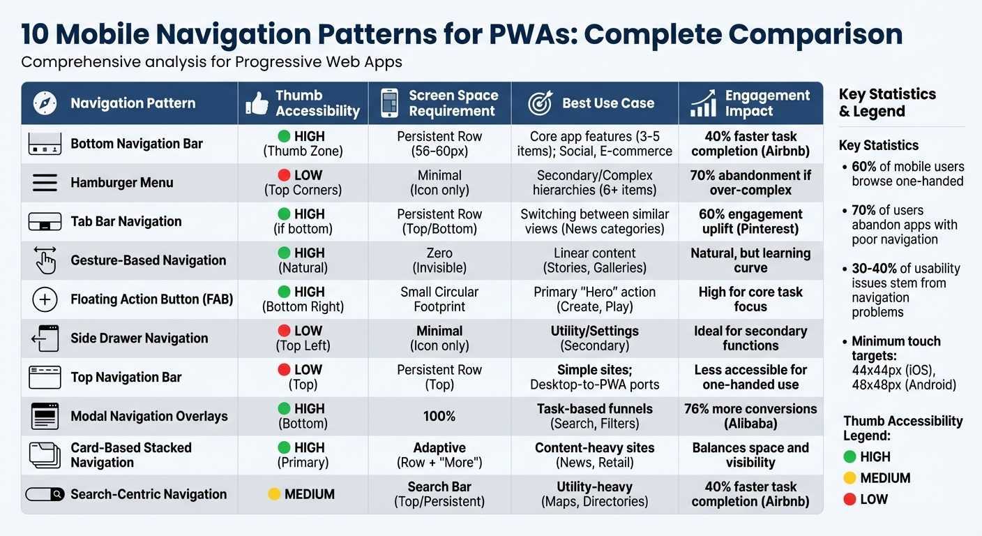
Mobile Navigation Patterns for PWAs: Comparison of 10 Design Approaches
Here’s a clear breakdown of the ten navigation patterns, touching on thumb accessibility, screen space use, and how they fit different PWA needs. These patterns range from handling content-heavy apps to supporting single-action utilities. The table also outlines their impact on user engagement.
| Navigation Pattern | Thumb Accessibility | Screen Space Requirement | Recommended PWA Use Case | Engagement Impact |
|---|---|---|---|---|
| Bottom Navigation Bar | High (Thumb Zone) | Persistent Row (56-60px) | Core app features (3-5 items); Social, E-commerce | 40% faster task completion (Airbnb) |
| Hamburger Menu | Low (Top Corners) | Minimal (Icon only) | Secondary/Complex hierarchies (6+ items) | 70% abandonment if over-complex |
| Tab Bar Navigation | High (if bottom) | Persistent Row (Top/Bottom) | Switching between similar views (News categories) | 60% engagement uplift (Pinterest) |
| Gesture-Based Navigation | High (Natural) | Zero (Invisible) | Linear content (Stories, Galleries) | Natural, but may involve a learning curve |
| Floating Action Button (FAB) | High (Bottom Right) | Small Circular Footprint | Primary "Hero" action (Create, Play) | High for core task focus |
| Side Drawer Navigation | Low (Top Left) | Minimal (Icon only) | Utility/Settings (Secondary) | Ideal for secondary functions |
| Top Navigation Bar | Low (Top) | Persistent Row (Top) | Simple sites; Desktop-to-PWA ports | Less accessible for one-handed use |
| Modal Navigation Overlays | High (Bottom) | 100% | Task-based funnels (Search, Filters) | 76% more conversions (Alibaba) |
| Card-Based Stacked Navigation | High (Primary) | Adaptive (Row + "More") | Content-heavy sites (News, Retail) | Balances space and visibility |
| Search-Centric Navigation | Medium | Search Bar (Top/Persistent) | Utility-heavy (Maps, Directories) | 40% faster task completion (Airbnb) |
What Stands Out?
With 60% of mobile users browsing one-handed, navigation patterns that prioritize bottom-screen placement - like Bottom Navigation Bars and FAB - are ideal for frequently accessed features. On the other hand, options like Hamburger Menus or Top Navigation Bars force users to stretch or reposition their grip, making them less convenient.
Screen space is a constant balancing act. Persistent patterns like Tab Bars and Bottom Navigation take up vertical space but keep key options visible. Meanwhile, hidden patterns, such as Hamburger Menus and Side Drawers, preserve content space but risk being overlooked. As Nick Babich, Editor-in-Chief at UX Planet, aptly notes:
"What's out of sight, is out of mind. When navigation is hidden, users are less likely to use navigation".
Why It Matters
Engagement metrics reveal how these patterns influence user behavior. For example, Airbnb’s switch to a bottom navigation bar with a prominent search option led to 40% faster task completion. Similarly, Pinterest replaced its Hamburger Menu with a Tab Bar, boosting engagement by 60%. On the flip side, 70% of users abandon apps when navigation feels overly complex. Navigation mishaps also account for 30-40% of all mobile usability issues.
Choosing the right navigation pattern is more than just a design decision - it directly affects whether users stick around or leave. This table and analysis highlight the trade-offs and opportunities that can shape user engagement and PWA performance.
Conclusion
Navigation is the core of your PWA's user experience. As Ksenia Toloknova, Product Designer and Design Lead, aptly states:
"Navigation is the heart of any mobile application. The success of an application may depend on how intuitive, efficient, and user-friendly its navigation is." - Ksenia Toloknova, Product Designer and Design Lead
When navigation is intuitive, users can complete tasks faster, stay engaged longer, and convert more effectively. On the flip side, poorly designed navigation accounts for 70% of user abandonment.
Different navigation patterns solve specific challenges. Bottom navigation bars and FABs make one-handed use easier. Hamburger menus and side drawers handle complex hierarchies, while gesture-based and modal patterns free up screen space for more immersive experiences. The trick lies in aligning the navigation approach with your app's structure, user behaviors, and business objectives.
Testing is non-negotiable. What works for a social media app might not suit an e-commerce platform or a content-heavy directory. Conduct A/B testing across iOS and Android, focusing on factors like touch target sizes (Apple recommends a minimum of 44x44px, while Android suggests 48x48px) and thumb zone accessibility. These insights ensure that navigation is optimized for all users, regardless of the app's focus.
Navigation problems are responsible for 30–40% of usability issues, often leading to users abandoning the app entirely. As Phone Simulator explains:
"The best navigation is nearly invisible until needed, easily accessible when required, and never gets in the way of primary tasks." - Phone Simulator
Start by identifying your users' most frequent actions. Prioritize the top 3–5 features and build your navigation around them. Don't hesitate to combine patterns - like using a bottom tab bar for primary actions alongside a hamburger menu for less common options.
The navigation choices you make today will shape how users interact with your app tomorrow. By iterating based on real user data and blending patterns thoughtfully, you can create a navigation system that feels natural, efficient, and aligned with user expectations.
FAQs
How do I pick the best navigation pattern for my PWA?
When deciding on the best navigation pattern for your Progressive Web App (PWA), the goal is to make the user experience as seamless as possible. Start by thinking about your users' needs, the complexity of your app, and the context in which it will be used.
Explore popular navigation options like hamburger menus, tab bars, or bottom navigation. Each has its strengths, but the key is finding one that matches how your users interact with your app and works well across different devices.
Stick to familiar UI patterns that users are already comfortable with. Once you've chosen a navigation style, test it thoroughly. Gather feedback and make adjustments to ensure it feels natural and avoids confusion. A well-thought-out navigation design can make a big difference in usability and overall satisfaction.
When should I combine a bottom bar with a hamburger menu?
When you want to make essential features easy to reach while keeping less-used options out of the way, try combining a bottom bar with a hamburger menu. The bottom bar can hold key actions for quick access, while the hamburger menu tucks away secondary options. This setup helps maintain a clean, organized, and user-friendly design.
How can I test if my navigation improves retention and conversions?
To determine whether your navigation improves retention and boosts conversions, start by conducting user testing and diving into engagement metrics. Experiment with A/B testing to compare different navigation designs and see how they influence behaviors like time spent on site, task completion rates, and bounce rates.
Keep an eye on retention patterns and key conversion indicators, such as sign-ups or purchases, to measure the effectiveness of your changes. It's also crucial to test navigation across different devices and collect user feedback to understand how adjustments impact overall satisfaction and engagement.